The project is situated in an artist village refurbished from an industrial complex. The company positions itself as a producer and promoter of the film in the cultural landscape of Beijing. The original buildings were constructed in red brick, a material that subtly revealed the distant industrial past of the district, creating a thick cultural je ne sais quoi to the studio spaces within the envelope. Contrary to what the brick envelope would suggest, Fabula Entertainment is a company comprised of energetic and highly motivated creative young generation, who dared to venture out of the box in search of a novel way of producing films.
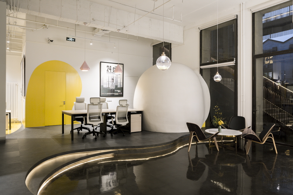
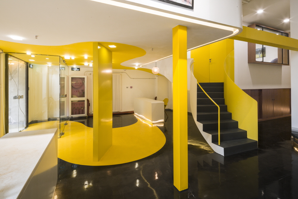
‘Fabula Entertainment’, which is called ‘Warm Current’ in Chinese, suggested that any projects in the production reel will strike a sympathetic chord among its audience, recalling the warmth in their hearts. In order to accentuate the company’s concept of ‘warmth’, the design adopted a binary colour palette comprised of yellow and white, which respectively represents warm stream and ice cold snow caps. It was through juxtaposing the two extremities that the warmth of the stream could be emphasized and cherished. The delineation between walls, ceiling and floor was dissolved by the gestural yellow stroke that runs continuously across the three surfaces. Furniture like the reception counter, lighting fixtures were painted white to resemble floating snow caps, while the white on the ground resembles streams from a melting glacier that meander through space, guiding visitors from the entrance deep into the space through different functional rooms of the studio.
The floor was screed and rendered with a glossy paint to further enhance the visitor’s impression of ‘walking upon a body of water’, which doubled the sense of spatial depth in a typical office of medium size. Apart from the above-mentioned effects the design had on the subconscious mind of the inhabitant, the design is also very practical in terms of providing sufficient visual contact and illuminations. The physical visual connection was one of the major drivers when designing the elements like mezzanine, stairs, raised floor, full height glazing and portholes. These elements provided nouveau vantage points and spatial relationship through the change of level and the articulation of thresholds. Privacy of the administrative staff was assured by the careful design of thresholds to provide an assured environment for key discussions. The South-facing administrative office, meeting room and changing room were separated from the North-facing open office area by a wall with a large porthole to facilitate supervision of the external staff from within the core of the office.
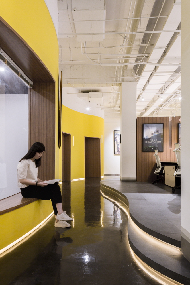
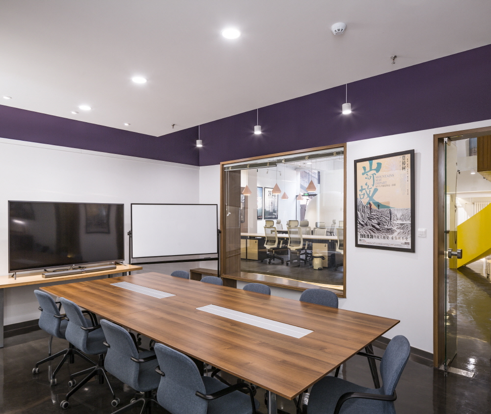
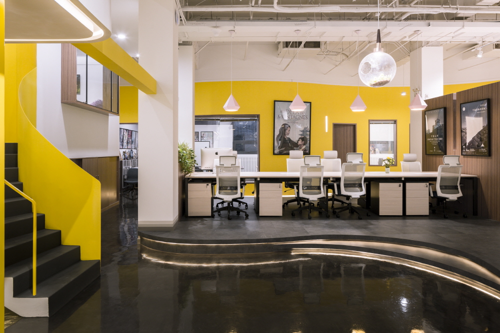
Raised floor system created the level difference between functional zones which acts as a clear demarcation in an open office without the obstructions of walls. Apart from a visual connection, the design was also thoughtfully devised to enable adequate illumination for both the administrative and open office. The orientation of administrative office ensured an efficient illumination from the south, by inserting the porthole at the separation wall, part of the natural light will penetrate into the central region of the open office. The open office, which faced north, was now better illuminated by the newly designed full height glazing on the north façade, the inner surfaces were finished in glossy white to give a more spacious impression of the otherwise crowded and poorly lit open office space. By the same token, certain wall edges, e.g. the washrooms are filleted to give a smooth and gracious wash of light over the inner surface to eliminate the claustrophobic quality of a narrow corridor. In addition to natural illuminating devices, warm-hued lamps, are adopted at corridors and other circulation paths, when paired with the yellowish floor, the direct and reflected light gives a warm and passionate hue that provide the sense of security and cosiness for workers even during those freezing cold winter days in Beijing.




0개의 댓글
댓글 정렬